In What ways does your media product use, develop or challenge forms and conventions of real media products?
Front Cover

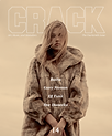
On the left is my final front cover product and on the right is an example of a front cover published by a regional magazine named The Crack. As a magazine aiming at a similar audience, genre and region, I decided to use and adapt conventions of The Crack in order to be able to appeal to my own audience. Although I used some similar conventions, I also manipulated features in order to make a unique and successful magazine of my own. In this evaluation, I will be making comparisons of all the features on my front cover to analysis how I was inspired by The Crack and why I have subverted certain features. I will also make reference to INDIE magazine as this is another media product I used for inspiration, specifically in terms of achieving a contemporary and quirky design however I developed the design to make it more regional.

Research and Planning
My research and planning stages really helped me to analyze real media products and find both the strengths and weaknesses to which conventions should be developed or challenged. This included deconstructing existing front covers, finding out generic conventions and analyzing what makes a front cover successful. I came to these conclusions throughout my research. Firstly, I believed my front cover needed to be creative in order for it to be memorable which I feel it has achieved by looking minimalistic yet incorporating a unique double exposure image. It achieves simplicity due to it being image led and not relying on too many cover lines to overcrowd the page which is what I found on some existing products which I disliked and therefore challenged. I feel my front cover is modern due to the contemporary style, young model and short, snappy cover lines. I feel that by sticking to these conclusions, I have been able to follow real media techniques that are most popular and those that I have found to be most memorable in order to make my front cover successful. After deconstructing front covers, I found that The Crack was the biggest real media product that I took most inspiration from and therefore influenced many of my creative ideas throughout the production of this final product. As you can see, the main things the Crack inspired me to do was have a simplistic style, limited colour scheme and an unstereotypical model that added a sense of quirkiness to the magazine. These are the main things I planned to take inspiration from however further inspirations were offered during the production stage which I will be analyzing for each individual convention of the front cover. I also challenged The Crack front cover in terms of layout, information and regional link. I also challenged the amount of detail to being more specific but focused. I wanted to include a sense of ambiguity so that the reader would stop and notice the cover. A lot of inspiration was taken from INDIE magazine also. I found INDIE to be my biggest creative and visual inspiration due to their quirky style. I did however majorly challenge their information and topics which were not really relevant to my chosen magazine. Evidence of the inspirations and challenges from my initial real media explorations are evident throughout all the conventions of my front cover.


Layout


The inspiration for the general layout of my billboard can be seen in that of The Crack however I did make my own dramatic changes in order to make my design unique. The development of my front cover from my initial ideas didn't really change that much as I felt I had created a concept that worked will without being too overcrowding. I took inspiration from having the dominant image centre of the page as I feel it directs the audiences eye-line straight to the content. I liked how the model was looking away from the audience and towards the opening of the page. I felt this was a convention that intrigued the reader into wanting to see what was inside the magazine therefore inspired the layout of my front cover image. I liked how simplistic the layout of The Crack front cover was as none of the conventions look overcrowded or too much to read. I took on board this minimal text design and was inspired to have only listed cover lines instead of framed and detailed ones. I did however change the layout of such and decided to position the sub sell lines at the bottom of the page rather than overlapping the image. I felt this made them much easier to read and therefore a convention of their own. I also decided, to challenge the Crack, I would include a main sell line and anchor which would replace the position of the cover lines. I feel a main sell line is important in supporting the image and giving a short background story which is why I chose to overlap it onto the image. Like most real media products, I have positioned the masthead across the top thirds of the page. This is extremely conventional for a front cover and therefore is successful in advertising the brand instantly. It although all the information that follows to be directly associated to the brand image. It also makes the brand more memorable for instance if the audience is only glancing at the front cover for a few seconds,this will be one of the first things they read. My strapline is also positioned in a very conventional location. This is at the top of the page and attached to the masthead. Although the Crack does not use or have a strapline, most real media products attach them to the masthead so that the strapline becomes a part of the brands identity. By layering at the top I therefore followed real media composition. A convention I have included which challenges the Crack is a sub-genre heading. I decided to position this in the top right corner of the page as I want it to be one of the first things that the audience read, besides the header. This is so they can instantly attach it to the front cover image and know which sub-genre the main feature article is based on. I also included a border convention to help aid the framing of the page and direct the audiences eye-line to the dominant image. The Crack positions its essential information in the bottom corner of the page however I decided to challenge this and position mine in the top right. This is because my information is much more detailed but also because I think it is important in a regional magazine and therefore needs to be in a more obvious place. Overall, I feel the conventional layout conventions. that I have challenged or developed make my magazine unique and those that I have taken inspiration from, help to aid its professionally. All of the conventions that I have used, masthead, sell lines, main sell line,,strapline, essential information and dominant image, are all present on the majority of existing real media products and therefore I feel my final product is successful at reflecting such. My main development is my layout which although was inspired by The Crack, is unique due to the changes and added conventions I have made.
Masthead + Strapline
When deciding on what to call my magazine, I wanted to focus on something that would be short, snappy and catchy but also representative of my regional community. I analysed my 3 favourite names which were NE Culture, CLIQUE or the EYE. I then carried out a target audience survey and CLIQUE was voted the most popular which verifies it will attract consumers when positioned on the front cover a magazine.By definition, a clique is a small close-knit group of people who share common interests and therefore I feel this will be relatable to the region as it suggests it is a community and therefore personal, relatable and dedicated to locals. It's a name that often refers to fan groups or friendship groups therefore will allow a strong, close relationship between product and consumer. Each social clique will usually have a specific style or unique taste that everyone shares and even though the broad genre of my magazine is culture, I have chosen by subcultures based on unique styles so that there will be something for everyone. I took inspiration from the Crack and other magazines in choosing a title that was just one word long and only 4 - 5 letters as this makes for a much more memorable read. I liked how the Crack used consonance sounds as well as onomatopoeia in their masthead as this allowed for the name to resonate with the reader. I used this convention and I feel the pronunciation of "CLEEK" is a successful trait. I also took inspiration from the crack for the uniqueness of their title.Even though it has no regional relevance, it makes me stop and wonder what it is and therefore I would be likely to pick it up in a shop. I have adapted this uniqueness in my own magazine however I feel I have developed a title that also has a community feeling and therefore is more successful in terms of being regional. Ultimately,Clique can be categorised as a modern audience word with a resonating sound and linking to a community and therefore I feel it is a successful convention of my magazine.
In design, I analysed a range of fonts on dafont.com however as it was going to be my icon and logo for my entire products, not just a masthead, I decided I wanted to make a design that was unique and therefore started from scratch. I a added a basic "Build Sans" font from Dafont.com into a Photoshop document. I then constructed a range of editing styles such as drop shadow, colour overlay and stretch tools to create the final masthead design that is featured on my front cover, contents page, billboard and website. I was inspired by The Crack's design of spreading the letters out so that the width of the masthead consumed most of the top thirds. This was an editing style that I took on board during the constructing on my masthead in Photoshop and I feel the outcome makes the CLIQUE a lot more dominant. One thing I challenged was the use of a drop shadow which I feel adds more depth to my masthead. I was inspired to do this by the NME masthead which contrasts the colours of red and white so that the text stands out a lot more. I therefore developed this and instead of creating a box tool, I contrasted my dominant colours of teal and duplicating and overlapping my masthead. I then took this further and added a white stroke tool so that the black was further defined. I feel this really helped my magazine to stand out a lot more and the dominant black is most effective against my chosen front cover background. Like most real media magazines, my front cover masthead follows the colour scheme of my house image and is capitalised in order to help it stand out.
Dominant Image


During my photoshoot, I used both a male and female model because I have a unisex audience and therefore wanted all of my audience to either be appealed or feel inspired to try and achieve the same look. It didn't make a drastic difference whether I used a male or female on my front cover as their body frame was mainly going to be used as a silhouette however I decided upon using my male model. This allowed for the double exposure of an image to be seen more clearly due to his short hair. He also had a bigger body frame than my female model which meant more of the overlapped image could be used and thus looked more effective. During my research, I found the type of model used on the front cover depends solely on the content of the page and what the main feature article is. As my article is about art, I feel that either gender would have worked.
My model is 24 years old and therefore fits into the target audience range of my magazine which is 18 - 25 year olds. This means that the front cover will attract the right kind of people due to this use of a familiar and relatable model. In my planning, I found out specific details about my model, Adam, and matched these specifically to my audience so that I could have a valuable representative of who they were with similar interests and a similar style to advertise the product. Most front covers adapt the model to fit the subject of the main feature article or to promote the celebrity or star who appeals to the audience due to their relatable features. For instance, KERRANG magazine is likely to use a middle aged male, rock style model with tattoos and piercings to promote their audiences interests. A magazine like We Heart Pop on the other hand would use a female model aged between 18 - 20 and wearing the bright colours of pink or red. I feel my front cover represents real media products due to the use of a model that reflects the audience and reflects the image of my brand.
Whilst planning my Photoshoot, I sent my model numerous outfit choices and he decided to choose outfit 1 which consisted of jeans, a plain design t shirt and white shoes. This however was not as important on the front cover as I decided to manipulate the image on Photoshop to make it more unique and creative by creating a double exposure effect. I created this by overlapping an image of my model with an image of a local scenery which I inverted and blended to get this final effect. Throughout my research, I have reflected and looked upon INDIE magazine as my main form of design inspiration. Whether that be for colour scheme, graphics or model pose, I really like how INDIE magazine have a quirky style front cover which makes their product stand out and look different. As it is a front cover product that I am creating, I feel one of the most important aspects is that it stands out and instantly draws in the readers attention. The graphic effect was therefore inspired by similar styles on INDIE front covers however I think this specific double exposure technique is unique to my magazine only and therefore a development of real media products. It uses the same conventions to appeal and attract however I have developed them in a way that make the image more qirky and contemporary.
In terms of color, my models outfit was pretty basic and minimal to begin with however I overlayed a teal tone to it during the editing stage. Once I had created my double exposure effect, I used a colour overlay of my dominant teal primary colour, in order to make the image link to the main colour scheme of my brand. The use of white and teal therefore fully links my front cover image with all of my other products and is successful in complimenting and standing out. Creating this teal exposure also allowed me to contrast the image with the pale grey background better and therefore allow it to stand out more and be more dominant. This style and use of image continuity was inspired by exsiting media products which use simplistic colors alongside one dominant colour. For instance, a lot of The Cracks front covers are produced in black and white to aid their black, white and grey house scheme. INDIE magazine on the other hand doesn’t have one specific scheme and therefore all of their front covers feature different styles depending on the issue. I therefore feel I have mostly been inspired by The Crack in terms of image continuity and have challenged INDIE magazine in sticking to a single scheme.
Using my research on facial expressions, I decided to challenge Trevor Millums theory and therefore challenge other real media products. Most front covers that I researched, use a practical or catalogue expression as this is the most professional and serious style. They accompany this with direct mode of address in order to grab the eyeline of the audience and therefore grab their attention. However, The Crack example that I looked at, really caught my attention due to the positioning of the model and their eyeline looking off the page. This made the cover more intriquing for me as I wanted to know what the model was looking at and therefore made me open the magazine. Due to this, I decided to use real media conventions by having a serious catalogue facial expression, however challenge conventions by using a side portrait of my model rather than a front facing image with direct mode of address. I also think this allowed the silhouette of my model to be more prominent and therefore the double exposure is more effective. The specific personality of the model is not as significant in relation to the main feature article and therefore I don’t think direct mode of address is needed. I want the features of my front cover to be attractive enough without needing to use eye line techniques and I think I have achieved this. I did however make sure that the overlapped image didn’t cover or block my models facial features. This is because in most magazines, the model is used to relate to the audience therefore I still wanted his features to be seen. The side portrait was inspired by The Crack but alongside my use of double exposure is more likely to make people stop and take notice than a regular front image. That is therefore why I challenged most real media products to make my dominant image more unique.
The image is a medium close up as this is what is most conventionally used on a front cover page. I followed this convention as most magazines use this as a medium between the different shot types. You can see in The Crack example that the shot size of my model in comparison is extremely similar. Looking off the page makes the reader want to follow the eye line of the model which then leads to the opening of the magazine. Through my research, I established that some front covers use props however I felt my image was dominant enough. I didn’t want the page to be too overcrowded as I wanted to achieve that sense of ambiguity and mystery to intrigue the reader. I used 3.0 lighting to make the model look fresh and this is a very common convention of front cover images which need to be extremely high quality to look professional. I feel the image is a statement within itself and therefore I don’t need any additional sub-images to aid its success.
Main Sell Line
Even though The Crack and INDIE were my main inspirations for my front cover, I challenged their conventions by using a main sell line which both magazines do not feature. When researching generic conventions of other magazines however I found that main sell lines are generally used on front covers to support the dominate image and promote a main feature article. I was inspired to overlap my main sell line with my dominant image by the likes of Q magazine and NME. Even though these are music magazines, they are extremely successful and therefore their conventions look very professional. Music is also a sub-genre to my magazine and therefore I still think the convention is adaptable to a regional magazine like mine. Like on Q magazine, I decided to make the main sell line the biggest text on my page, after my masthead. This allows it to be acknowledged as the main feature story and not just another sell line. I decided to use the colours of my dominant scheme as backgrounds for my main sell line as this helps to make it stand out even more whilst sticking with the theme of my page. I also used a unique font for my main sell line which doesn’t feature anywhere else on the page. Most real media products don’t change the font but just change the size of it. I therefore challenged this as I thought a unique font that was personalized to the feature article would be more effective. The font was from dafont.com under the theme “Tech” as I feel a topic about holographic art needed a futuristic style font to be complimentary. I chose to use a white font so that the sell line would contrast with the other cover lines of my page which are black. The text is capitalized in order to stand out and look most dominant. I have made sure it overlaps the model as this is conventional but doesn’t overlap any main features such as the face or expressions. Another way I developed the design of this is by overlapping it on my border. This is quite unconventional as normally all the information would stay inside the borders however I thought this looked more creative and therefore like the outcome. It shows that the main sell line is quite dominant and therefore makes it most noticed.
The main sell line reads “Baltic Art Goes Techno” which is quite brief and mysterious. This type of language is typical of a double page spread as the audience need to be intrigued to be drawn in however too much information shouldn’t be given away as this would stop them from purchasing. I have added a summary/anchorage to my main sell line to give a slight taste of what is in store, but again not too much information. The anchorage reads “meet the mind behind this holographic creation.” Again, this is quite ambiguous and therefore will draw the reader in and make them want to find out who the mind is and what has been created. As my audience is quite mature, 18 – 25, I didn’t want to be overly exaggerative on my front cover like the likes of we heart pop or Kerrang. I wanted to be short, snappy but intriguing and I feel I have achieved this with my main sell line. Again, the font I have used for this anchorage is unique to the page but relevant to the double page spread and ties in with the techno and art theme which looks effective. I decided not to feature the same story on my front cover as I have created on my double page spread. This is because the double page spread is pages 3 and 4 and I don’t think the immediate article would be on the front cover. It is more conventional for the front cover to advertise the feature article that is in the middle of the magazine therefore that is why I decided to focus the main sell line on art and not my film festival review. I feel that using this convention has been inspired from real media products however my design is creative and challenges other magazines. In terms of regional layout, The Crack and Spark don’t have main sell lines that are as obvious and therefore this is a challenge to those.


Other Text


When researching Front Covers, I noticed that there is a divided opinion between the amount of text that should be present on the page. Some front covers offered a very minimalistic style such as The Crack and INDIE magazine which only include cover lines or even just one line. I feel this super minimalistic look is successful in creating a contemporary style however can look quite bare if not designed correctly. I felt I wanted the same contemporary style however also wanted to challenge it and my own conventions to bulk up the page a bit more. The next type of front cover I found was the likes of Spark which was highly detailed and full of text. I felt that the design of this was nice however it looked very overcrowded and maybe would put people off, especially my audience who have a low attention span. Due to this, I decided to develop both forms of real media products and create a front cover with a media amount of text, neither too detailed or too bare. I wanted my front cover to be short, snappy and straight to the point whilst also having an attractive design which I feel I have achieved by my medium but minimal use of text.
The Strapline is a convention I decided to feature on my front cover and attach to my masthead. My strapline is effective as it includes both the region my magazine is aimed at as well as the genre of the magazine. This means that the audience can instantly recognise the content and aim of the brand so that they will have a general idea of what to expect. I want to make my strapline a well-known phrase which is always associated with my brand and therefore by positioning it next to the “Clique” masthead I feel this can be achieved. CRACK and INDIE don’t have straplines however I feel it is an important convention to give the audience fast and immediate back story on my magazine. It is however very conventional to use a masthead and strapline as a combined feature and therefore I have sued real media features in this sense. I have included this strapline on all my products so that they all link back to the front cover and show my brand works together effectively. I used the same strapline font on all products also with the same size text and therefore I feel it has become part of my brands identity which is why it was essential it was featured on my front cover.
Sell lines or Cover lines are a very generic convention of a front cover and therefore I was inspired to include them in my own production. Unlike last year, I have designed my sell lines in a much more unusual and creative way. Stereotypically, sell lines frame the dominant image and are positioned down the left and right thirds of the page. I have instead positioned my sell lines all at the bottom of the page. I was inspired to do this by The Crack who challenges conventions themselves. The Crack often places their sell lines either vertically down the pages or overlapping the model which is very unusual. I wanted to create an unusual style myself and therefore I developed such by putting mine at the bottom of the page. I feel this makes the top and bottom of the cover look well framed which draws more immediate attention to the dominant image. It also prevents the image from being overcrowded and therefore I have achieved my simplistic and contemporary style by doing such. I was further inspired by The Crack to make my sell lines short, snappy and straight to the point. I like how The Crack used a list format to present their sell lines unlike other magazines who break up each line into its own convention. I think this really helped to achieve the minimalistic look and therefore I am happy with the outcome. I did however develop the sell lines slightly more than the crack by making them more diverse. The crack usually tend to just list artist names in their sell lines as this is a good way of promoting to get attention from well-known people. I instead decided to add sell lines for different sub-genres of my magazine and relate each to the region by using colloquial language. For instance, I mde reference to regional locations such as sunderland and Newcastle. I broke up each sell line by using a / which I think helps to make the list less long. The number of sell lines I used (6) was also inspired by real media products as this is an average amount for the cover. I have made the sell lines black and used a faded white tool box to contrast the background. This helps them to stand out and be easily read against the background.
In the top right of my front cover is the essential information. This includes the website, issue number, date and price of the magazine. I decided to include this information because I think they are the most vital facts about my product that would encourage people to buy the issue. ~They are also needed for returning customers so they can see what issue it is and whether they have read it yet. The price is a contributing factor which would encourage people to want to read more into the brand as free things are often most appealing to my young audience. I was inspired to include this information by magazines such as Spark which includes the issue number, issue type, price and website. I feel this is effective for someone who hasn’t seen the brand before as they instantly have the essential information to find out more. One of the main reasons I decided to include the web address on the front cover is to encourage people to become active audience members rather than passive. It hints that my magazine will be modern and up to date but also promotes my other platforms which is beneficial.
One main convention that challenges real media products is my sub-genre heading bar. I have not seen this convention used by any other magazine therefore I feel it is a challenge to the normal front covers. I decided to include this bar as it is a good way of showing what the main feature article is instantly about whilst also advertising the other sub-genres that a featured in the magazine. My strapline provides the main genre of my magazine which is culture, however culture is very broad and therefore people may not realise this includes different topics that their interests may lie in. I therefore decided that by adding this sub-genre heading, I can instantly show the different genres available and therefore less likely to alienate nay potential audience members. I have highlighted the art genre in orange. This is the secondary colour I chose for this specific group and therefore shows unison throughout my magazine. It also immediate shows that the front issue is about art and therefore the audience will know that any orange pages to come will be focused on art. For each new issue, I will colour the sub-genre that the feature article is based on. This will mean each issue is unique but also shows continuity with advertising the subheads. The spark sort of advertise their content type on the front cover for instance it says, “Proms 2015” which instantly tells you it is a prom main feature article however it doesn’t list any other sub-genres. To me, it therefore suggests this magazine will just be about proms which would prevent me from purchasing it however because I already have the magazine I know that there is other content in it such as events and music. I feel my front cover therefore fully advertises all branches of my genre due to this subhead therefore it is a successful convention in appealing to all potential audience members.